Format your Slack messages, please!


Have you ever seen an important announcement message in Slack with a thread containing more replies than items in your weekly shopping list? Everyone has!
It’s even worse when you are the author of the announcement. There is nothing more time-wasting than getting 5 questions that you’ve already answered in the announcement.
But sometimes that’s the better outcome. Worst case – your message is wholly overlooked by the audience.
But there is a simple solution we all already know – good message formatting.
The rules of formatting
You’ve probably heard of message formatting but don’t use it in day-to-day communication. It is quite a shame because all well-known communication apps offer more than enough formatting features.
- Eye-catcher: Well-formatted messages stand out in busy channels, ensuring they’re noticed amid the constant influx of new content. With visual appeal, your message captures attention, preventing it from being overlooked amidst the distractions.
- The audience gets the main takeaways: Formatting improves clarity, emphasizes key points, and guides readers through lists or steps. Utilize options like bold or italics to highlight the main takeaways and make them stand out. Well-structured messages enable quicker scanning, ensuring readers grasp the important points efficiently.
- Save money: A well-formatted message saves time. And as they say, “Time is money.”
- Better feeling (subjective one): As software engineers, we appreciate clean, structured formats that demonstrate professionalism. Remember when we had to follow strict standards for our university theses? It showed respect for the community. Though we’re not obligated to follow standards in everyday messages, I’ve made it a habit since then.
Don’t format one-liners!
There is one thing I have to say: you do not have to format every single message. As it was already mentioned, it takes time to format the message.
The main rule is easy: “The longer the message, the more needed formatting is”.
It is obviously a waste of time to format one-liner messages. There are a couple of factors to guide you when deciding if formatting is needed and what tools to use:
- Message purpose: Well-formatted announcements or summaries in company-wide channels will be better received. On the other hand, direct or thread messages are usually shorter, which implies the mentioned main rule. They have character, like instant or chat messages so you already have attention.
- Audience: It’s natural – you will use more code blocks and emojis when messaging your colleagues, and more lists, paragraphs, and bold options when sending report-like messages to your managers.
How to design a message?
All well-known communication applications offer a set of tools you can use not only to format but, as I call it – to design messages.
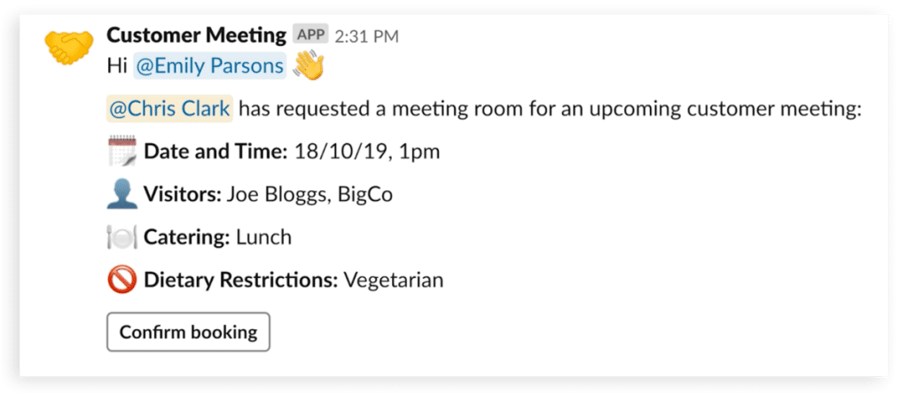
Professional designers will probably disagree with me on the designing part, but see the message below, isn’t it beautiful? It’s concise, catches the attention immediately, and it contains all the important information you need.

There is no strict guide on how to make your message well-designed, but:
- Message hierarchy: use bullet or numbered lists. It might sound like trivial advice, but creating a new paragraph by putting something on the new line helps you to separate individual thoughts.
- Highlight message key points using bold, italic, or underline.
- Use emojis as eyecatchers or focus points. They are colorful, meaningful, and useful when used in a reasonable way. Do not overuse, though; we don’t want our message to look like from a teenagers’ chat.
- In case you already know the message @recipient you can tag them explicitly.
- Last but not least, there is a feature all engineers love and use it so much frequently – code block.
We missed a critical update because it was a block of text
I have seen small teams using clean message design for easy standups. Just agree on the three emojis labels for “Finished,” “In progress,” “Challenge”, and have every team member fill in the “form” daily. It provides quick visibility to the whole team and keeps everyone informed.
Our team uses something similar. Every person who joins our channel is welcomed by a message from ChatBot with instructions on how to send the message in order to fix a problem in the shortest possible time. It speeds up troubleshooting process for both sides.
Let’s finish with a real-life example of the importance of clear and concise communication. My team once faced difficulties due to missing a change announcement presented as plain text. After that, we established a system of communication between frontend and backend teams to notify each other of every change with clear messages. Since then, we’ve never overlooked any changes.
Next time you have to communicate more than a single line of information, consider experimenting with message design to enhance readability. Good message design makes it easier for your colleagues to read it and for your message to not be overlooked!


